Kleenex
Kleenex
DURATION
1 Week
DURATION
1 Week
CLIENT
Kleenex
CLIENT
Kleenex
Logo & Visual Identity
Logo & Visual Identity
Label Design
Label Design
Digital Design
Digital Design
Pitch Deck
Pitch Deck
PROJECT OVERVIEW
PROJECT OVERVIEW
Kleenex Australia were after two designed tissue boxes that elevated everyday functionality through the lens of interior design. The objective was to create packaging that not only reflected the latest home styling trends but also blended seamlessly into contemporary living spaces—transforming a household essential into a curated décor element.
Kleenex Australia were after two designed tissue boxes that elevated everyday functionality through the lens of interior design. The objective was to create packaging that not only reflected the latest home styling trends but also blended seamlessly into contemporary living spaces—transforming a household essential into a curated décor element.

The Challenge
The Challenge
In a competitive FMCG space where packaging is often overlooked, Kleenex needed designs that stood out at shelf level while feeling right at home on a countertop. The challenge was twofold: to capture 2020’s evolving interior design aesthetics, and to translate them into artwork that resonated with both form and function—balancing visual beauty with brand familiarity.
In a competitive FMCG space where packaging is often overlooked, Kleenex needed designs that stood out at shelf level while feeling right at home on a countertop. The challenge was twofold: to capture 2020’s evolving interior design aesthetics, and to translate them into artwork that resonated with both form and function—balancing visual beauty with brand familiarity.

WHAT WE DID
WHAT WE DID
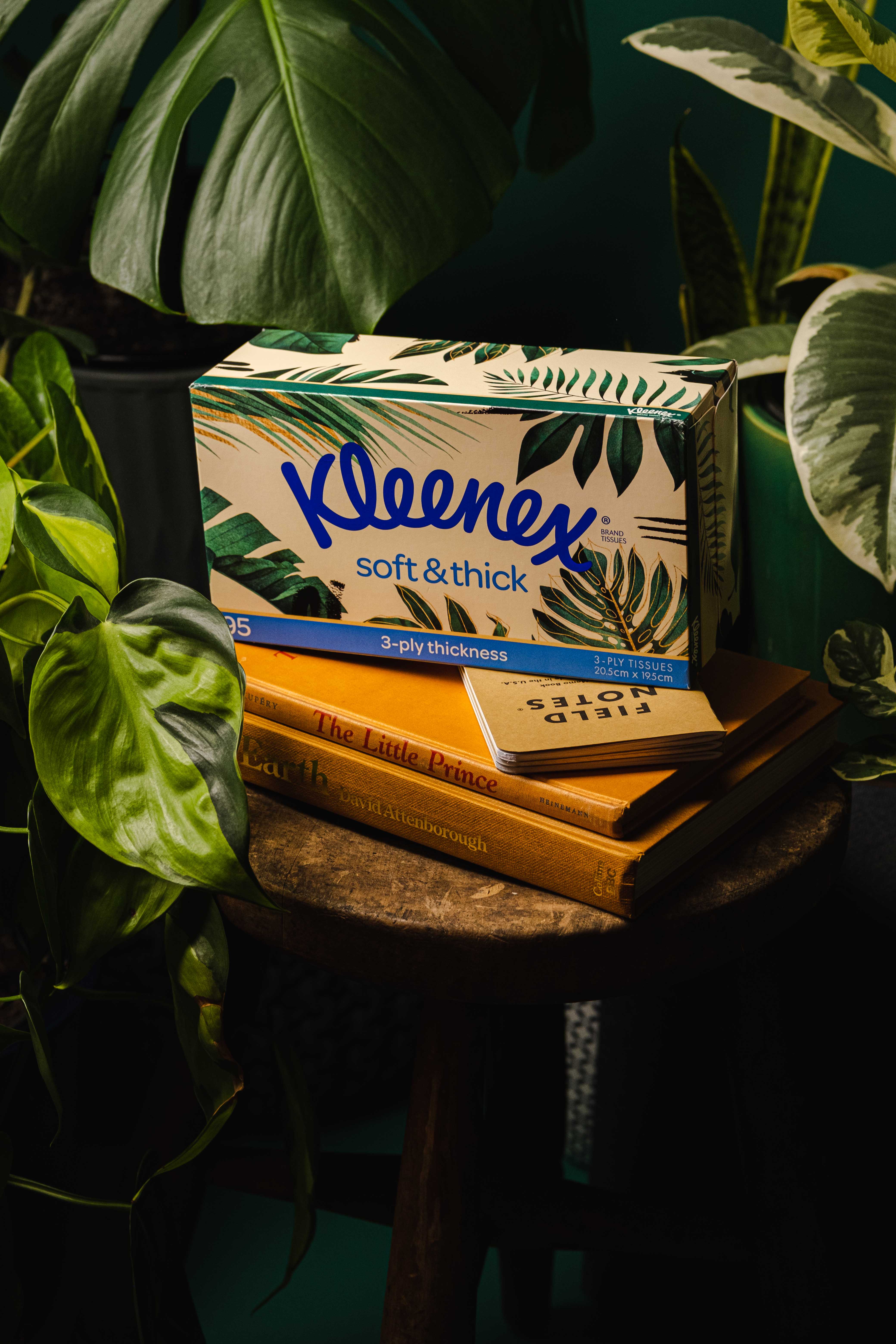
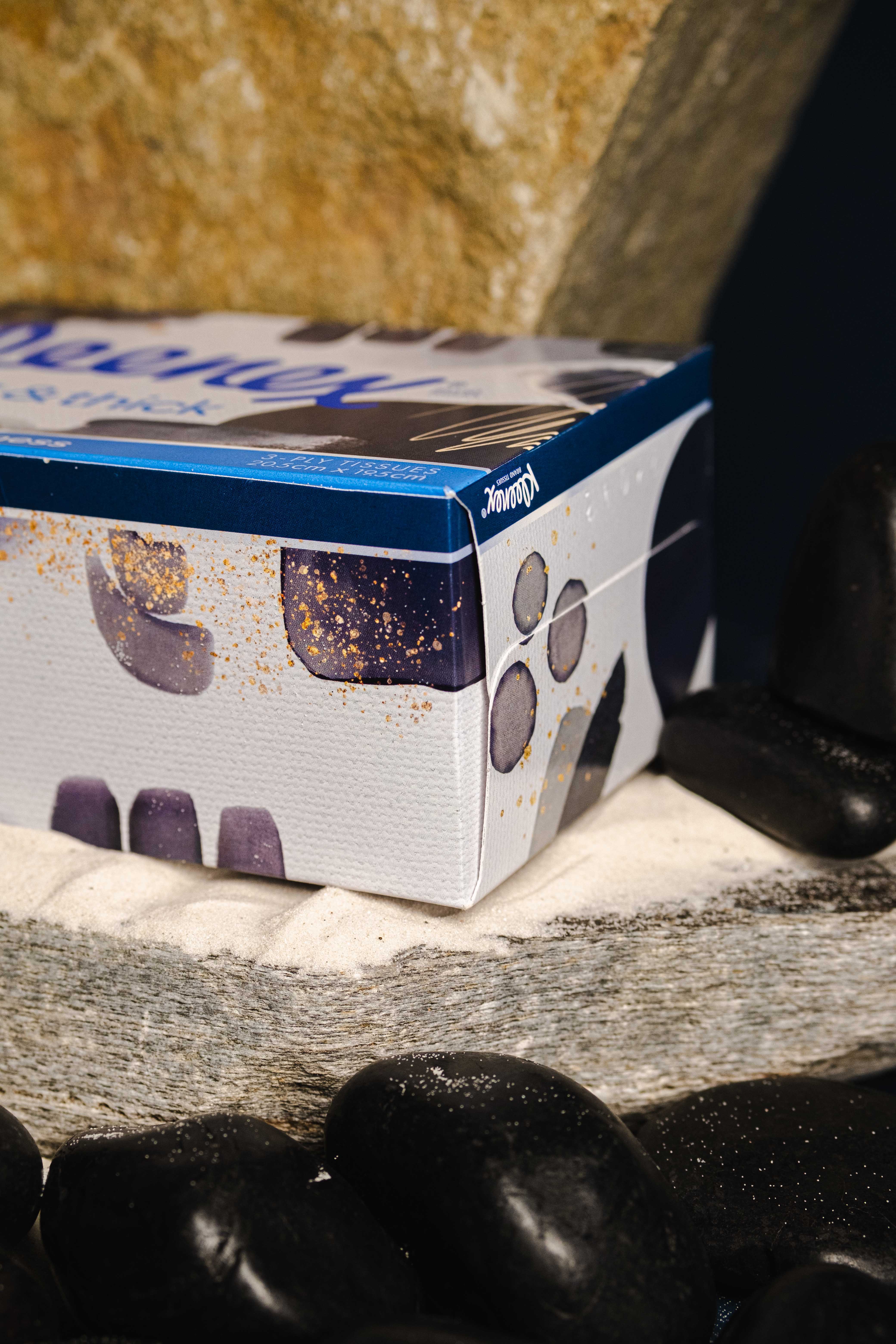
Amber designed two distinct packaging concepts aligned with key 2020 interior trends. The first embraced the “Bringing the Outdoors In” movement, featuring hand-illustrated watercolour palms and warm tones to evoke a calming, nature-inspired feel. The second design drew from the “Deep Navy” trend, using rich indigo tones and abstract textures to create a more refined, minimalist aesthetic. Both boxes were crafted to elevate the everyday—offering visual appeal that seamlessly integrates into modern home environments.
Amber designed two distinct packaging concepts aligned with key 2020 interior trends. The first embraced the “Bringing the Outdoors In” movement, featuring hand-illustrated watercolour palms and warm tones to evoke a calming, nature-inspired feel. The second design drew from the “Deep Navy” trend, using rich indigo tones and abstract textures to create a more refined, minimalist aesthetic. Both boxes were crafted to elevate the everyday—offering visual appeal that seamlessly integrates into modern home environments.


