Mark Bullivant
Mark Bullivant
DURATION
2 Months
DURATION
2 Months
CLIENT
Bullivant Coffee
CLIENT
Bullivant Coffee
Logo & Visual Identity
Logo & Visual Identity
Packaging Design
Packaging Design
Print Collateral
Print Collateral
Pitch Deck
Pitch Deck
PROJECT OVERVIEW
PROJECT OVERVIEW
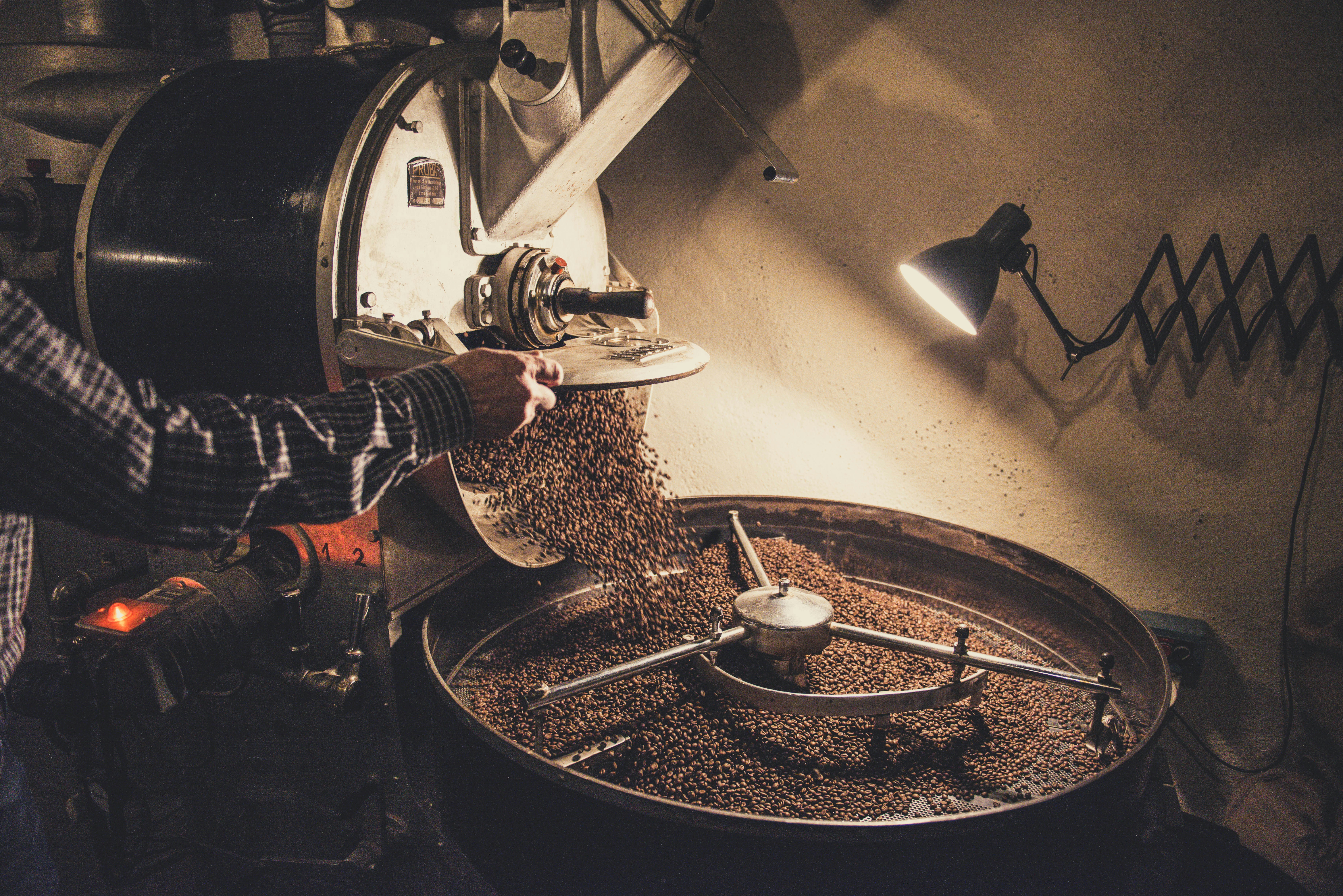
Mark Bullivant Coffee is a family-run coffee roaster based in Byron Bay, blending warm hospitality with a deep love of craft. In a region known for boutique coffee culture, the brand needed an identity that felt both nostalgic and distinct—something that would capture the essence of their personality and help them cut through a saturated market.
Mark Bullivant Coffee is a family-run coffee roaster based in Byron Bay, blending warm hospitality with a deep love of craft. In a region known for boutique coffee culture, the brand needed an identity that felt both nostalgic and distinct—something that would capture the essence of their personality and help them cut through a saturated market.

The Challenge
The Challenge
In a sea of artisanal roasters and overly serious coffee branding, Mark Bullivant Coffee needed a visual identity that was memorable, light-hearted, and deeply rooted in character. The challenge was to develop a brand that paid homage to coffee’s rich cultural history while reflecting Mark’s playful spirit—creating something that felt both timeless and fresh.
In a sea of artisanal roasters and overly serious coffee branding, Mark Bullivant Coffee needed a visual identity that was memorable, light-hearted, and deeply rooted in character. The challenge was to develop a brand that paid homage to coffee’s rich cultural history while reflecting Mark’s playful spirit—creating something that felt both timeless and fresh.


WHAT WE DID
WHAT WE DID
Amber created a retro-inspired brand identity that captures the heart of vintage coffee culture with a modern twist. Warm, earthy tones and carefully curated typography evoke the charm of classic coffeehouses, while playful details bring Mark’s exuberant personality to life. The custom logo references retro signage and packaging, giving the brand a sense of heritage and soul. Every design element—from type to layout—was chosen to transport customers to a slower, more intentional era, turning each coffee moment into a nostalgic ritual.
Amber created a retro-inspired brand identity that captures the heart of vintage coffee culture with a modern twist. Warm, earthy tones and carefully curated typography evoke the charm of classic coffeehouses, while playful details bring Mark’s exuberant personality to life. The custom logo references retro signage and packaging, giving the brand a sense of heritage and soul. Every design element—from type to layout—was chosen to transport customers to a slower, more intentional era, turning each coffee moment into a nostalgic ritual.