Why Luxury Brands Are All Wearing the Same (Logo) Dress
Why Luxury Brands Are All Wearing the Same (Logo) Dress
Dec 28, 2024
Dec 28, 2024
The rise of the minimalist sans-serif, and what it really says about your brand.
The rise of the minimalist sans-serif, and what it really says about your brand.
Once upon a time, luxury logos dripped with personality—ornate scripts, heritage crests, hand-drawn marks. Fast-forward to now, and everyone from Burberry to Balmain seems to be following the same playbook: clean, minimalist sans-serif wordmarks. So what happened? Did luxury suddenly lose its flair?
Not quite. Luxury just slipped into something more...timeless.
The Rise of the “Little Black Dress” Logo
In fashion, the little black dress is iconic—simple, versatile, and quietly powerful. It doesn’t shout. It whispers with confidence. And that’s exactly the energy luxury brands are channeling with their new identity systems.
The shift to pared-back, sans-serif logos is less about sameness and more about strategy. Here's why:
1. Simplicity Signals Confidence
Luxury isn’t about showing off anymore—it’s about showing up with quiet assurance. A minimal wordmark says:
"We don’t need embellishment to prove our worth."
This restraint aligns with the modern luxury consumer—discerning, design-savvy, and allergic to clutter.
2. Timelessness Over Trendiness
Ornate logos can feel rooted in a specific time period. Sans-serif marks, by contrast, often feel timeless and adaptable—perfect for brands operating across digital platforms, packaging, and campaigns. They’re the typographic equivalent of never going out of style.
3. Global Versatility
High-end brands are global now, with audiences from Tokyo to Paris. Sans-serif typography is legible, scalable, and culturally neutral—making it ideal for global recognition.
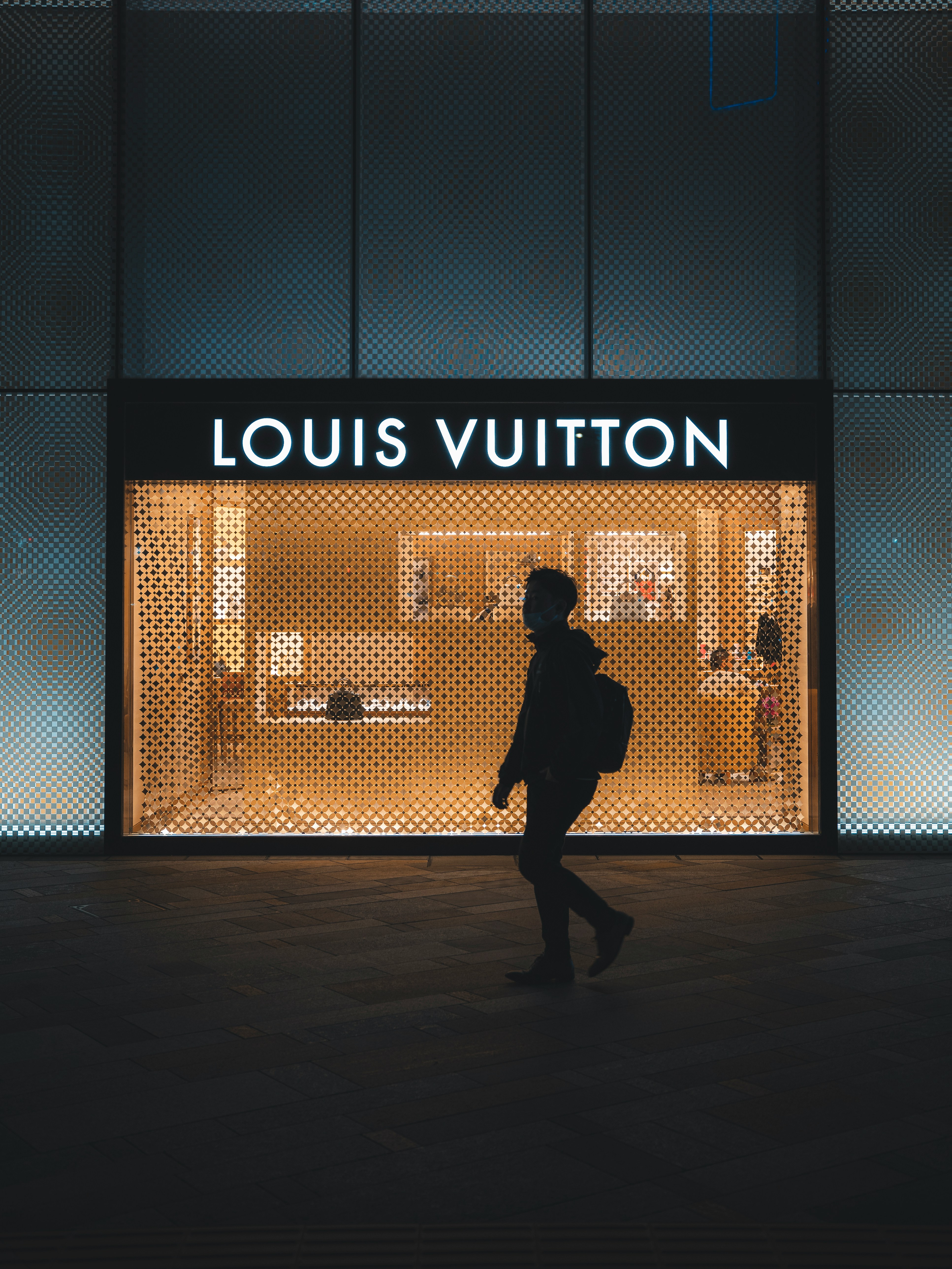
4. Digital First Design
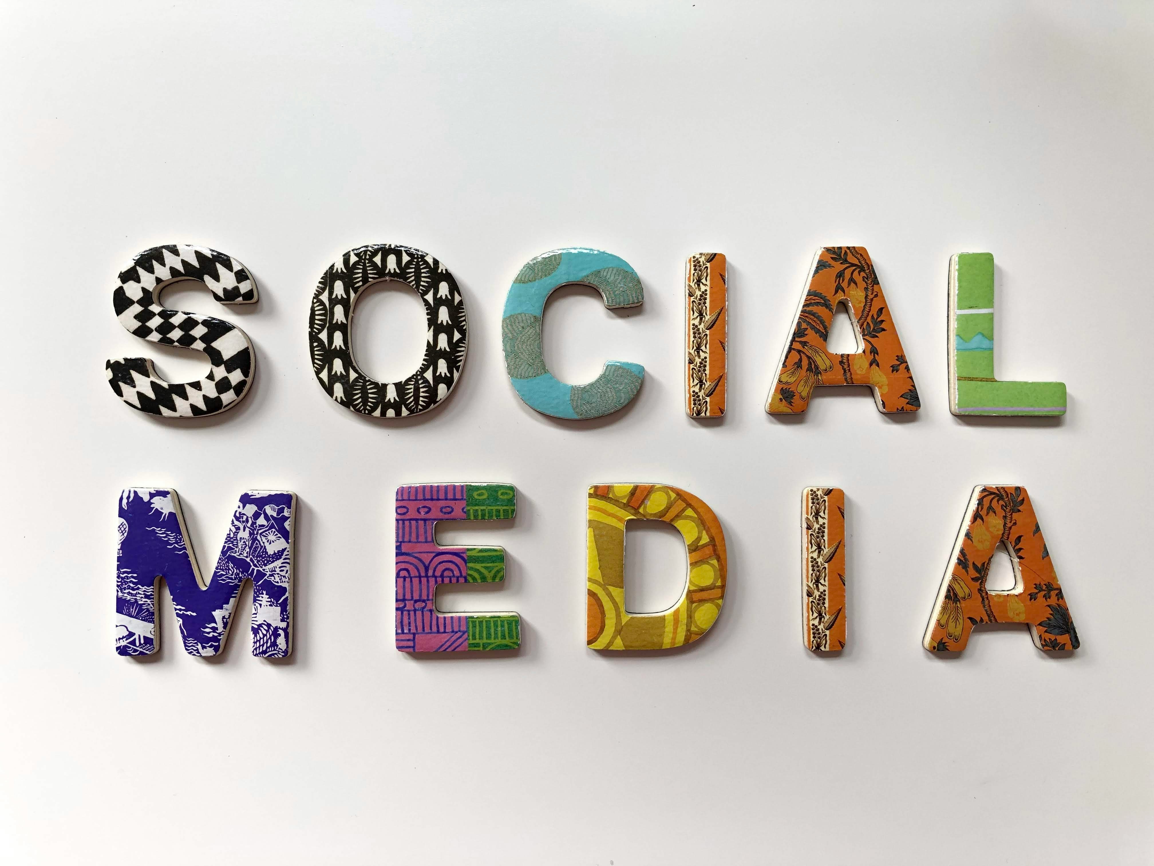
Let’s face it—if your logo doesn’t sing on a screen, it’s falling behind. Sans-serif wordmarks are optimized for mobile viewing, responsive design, and social media profiles. They crop clean. They scale seamlessly. They stay sharp on a favicon.
5. It’s Not Boring—It’s Intentional
Critics call it "blanding." Designers call it clarity. When done right, a minimalist logo isn’t a lack of effort—it’s a masterclass in restraint. It shifts the focus from decoration to cohesion, allowing every brand touchpoint to feel like part of the same elevated experience.
So...Should You Go Sans Serif?
Not always. But if your brand thrives on subtlety, precision, and a certain modern elegance, the minimalist route may be your best move. At Caliba Studio, we don’t chase trends—we design with intention. Whether your brand needs a bold mark or a whisper of refinement, the key is making it unmistakably you.
Because sometimes, saying more means saying less.
Once upon a time, luxury logos dripped with personality—ornate scripts, heritage crests, hand-drawn marks. Fast-forward to now, and everyone from Burberry to Balmain seems to be following the same playbook: clean, minimalist sans-serif wordmarks. So what happened? Did luxury suddenly lose its flair?
Not quite. Luxury just slipped into something more...timeless.
The Rise of the “Little Black Dress” Logo
In fashion, the little black dress is iconic—simple, versatile, and quietly powerful. It doesn’t shout. It whispers with confidence. And that’s exactly the energy luxury brands are channeling with their new identity systems.
The shift to pared-back, sans-serif logos is less about sameness and more about strategy. Here's why:
1. Simplicity Signals Confidence
Luxury isn’t about showing off anymore—it’s about showing up with quiet assurance. A minimal wordmark says:
"We don’t need embellishment to prove our worth."
This restraint aligns with the modern luxury consumer—discerning, design-savvy, and allergic to clutter.
2. Timelessness Over Trendiness
Ornate logos can feel rooted in a specific time period. Sans-serif marks, by contrast, often feel timeless and adaptable—perfect for brands operating across digital platforms, packaging, and campaigns. They’re the typographic equivalent of never going out of style.
3. Global Versatility
High-end brands are global now, with audiences from Tokyo to Paris. Sans-serif typography is legible, scalable, and culturally neutral—making it ideal for global recognition.
4. Digital First Design
Let’s face it—if your logo doesn’t sing on a screen, it’s falling behind. Sans-serif wordmarks are optimized for mobile viewing, responsive design, and social media profiles. They crop clean. They scale seamlessly. They stay sharp on a favicon.
5. It’s Not Boring—It’s Intentional
Critics call it "blanding." Designers call it clarity. When done right, a minimalist logo isn’t a lack of effort—it’s a masterclass in restraint. It shifts the focus from decoration to cohesion, allowing every brand touchpoint to feel like part of the same elevated experience.
So...Should You Go Sans Serif?
Not always. But if your brand thrives on subtlety, precision, and a certain modern elegance, the minimalist route may be your best move. At Caliba Studio, we don’t chase trends—we design with intention. Whether your brand needs a bold mark or a whisper of refinement, the key is making it unmistakably you.
Because sometimes, saying more means saying less.